Logistics · Road freight & courier · Case study
Built before the photographs: the Central Couriers site
A road freight site with no photographs yet: a palette taken from motorway signs, the quote form as the hero, and service pages that name the cheaper option.
- Astro on Vercel (London, lhr1)
- Per-site palette over a shared design system
- Typed service register driving pages, nav, footer and schema
- One hours source: display, live status and OpeningHoursSpecification
- Service · FAQPage · BreadcrumbList JSON-LD
- Email-native forms, no database
- Type-checked quote attribution
- Share card rendered by headless Chrome
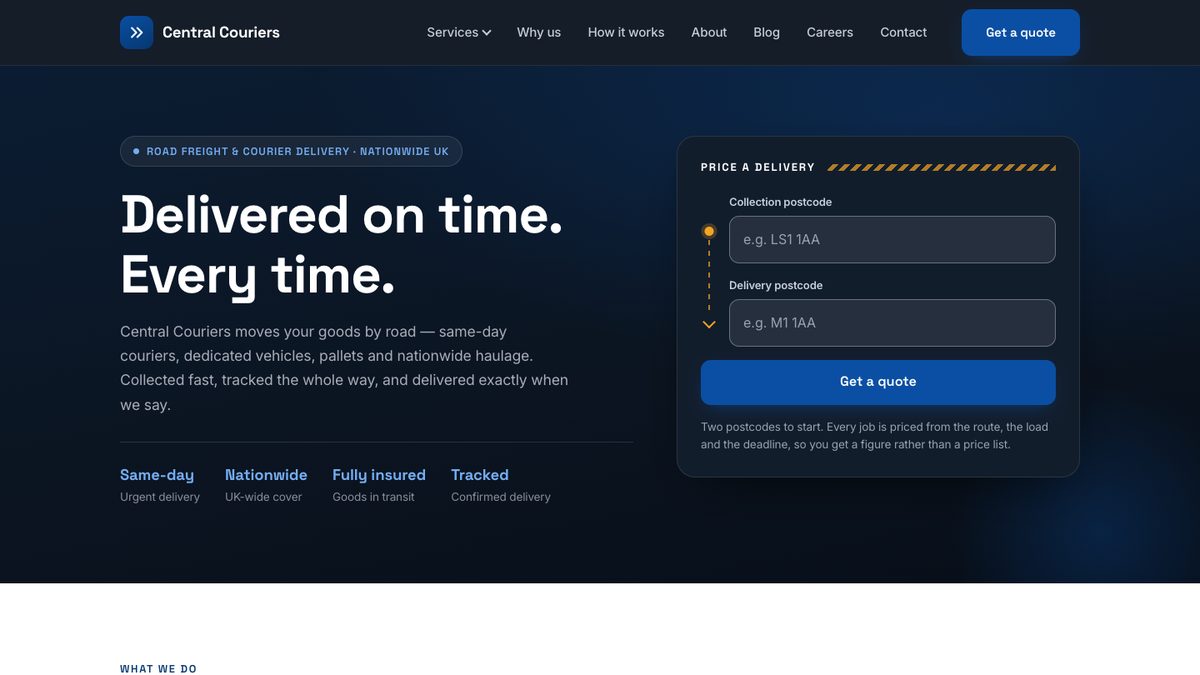
Central Couriers Ltd is a Leeds-registered road freight and courier company: same-day runs, booked deliveries, dedicated vehicles, pallets, long-distance haulage and regular contract work across England, Scotland and Wales. It is a client, and this is a case study about a site that has not launched yet, which changes what it is allowed to say.
So the disclosure comes first. The site is live at centralcouriers.vercel.app, on its preview address, because the business has not chosen its domain. Its quote and careers forms are built, tested and deployed, and they are not switched on: sending email needs a domain verified with the mail provider, and there is no domain yet. Until then each form tells the visitor plainly that online quotes are not available, rather than taking their details and quietly dropping them. There are no enquiry numbers, rankings or traffic figures on this page, because there are none to report. What there is, is the build, and every claim below can be checked against the live site tonight.
The brief, and the constraint that shaped everything
A freight company’s website normally leans on two things: photographs of the vehicles and numbers about the operation. Fleet size, years trading, deliveries made, depots run. This site has neither, and it will not invent them.
That is written down, not implied. The data file every service page is built from opens with its rules: no fleet size, no driver or depot counts, no years trading, no customer numbers, no prices, and no promise about how fast anyone answers the phone. “Same-day” and “next-day” are service types a customer chooses, never a claim about response time. Those rules are also written into the test suite, so breaking one is a failing test rather than a matter of someone happening to notice: a pound sign followed by a digit anywhere in the service copy fails it, and so does a phrase like “our fleet of” or “within the hour”.
The design problem was therefore to build a site that is persuasive on what the business can actually stand behind: clear service definitions, an honest account of how freight is priced, and a quote flow that respects the visitor’s time.
A palette taken from the road
The site began on a generic SaaS blue, chosen for being blue. It now borrows from the one visual system the trade already owns.
A blue taken from motorway direction signs carries everything that is text: links, buttons, numerals. It measures 7.9:1 against white, past the 7:1 that WCAG’s AAA tier asks of body text, so it needs no darker variant. Beside it sits a high-visibility amber, the colour of beacons and of the diagonal stripes on a goods vehicle’s rear marking. The amber measures 9.1:1 on the site’s night navy and only 2.0:1 on white, so it is a dark-ground and graphic colour only, and it never carries text on paper. Those ratios are computed and written in the source beside the colours they justify.
The palette is injected per site rather than written into the stylesheet, so the colours live in one place and can change without anyone hunting through CSS for them. The one repeated mark is the chevron, used sparingly: the brand icon, the rule above the quote panel, the list markers where a list is a set of instructions.
The van that was not a van
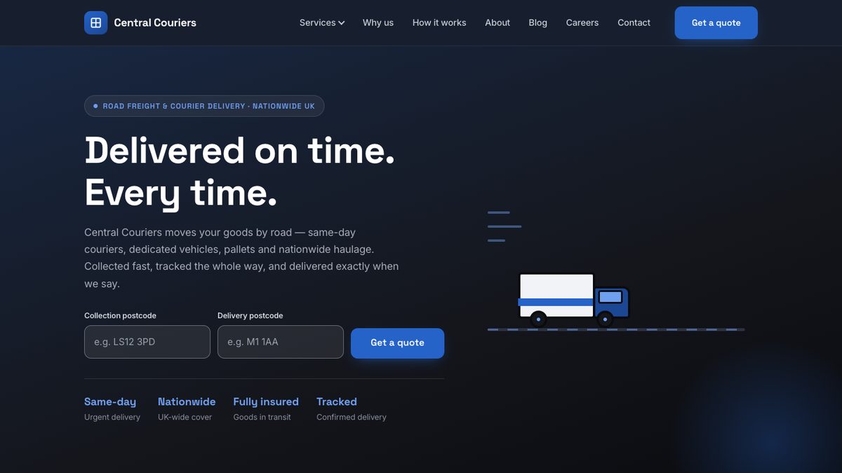
The old hero held a delivery van on the right-hand side. It was drawn out of eleven styled rectangles: a box, a cab, a window, two wheels, a road and three speed lines. A cartoon, on a freight company’s front page, in the space where a photograph belongs.
Until there are real photographs, that space is better spent on the thing the hero exists to start. The quote entry is the hero art now: collection above delivery, joined by a route rail that runs from a dot at the pick-up to a chevron at the drop. It is the only ornament in the first screen, and it is the only one saying something.
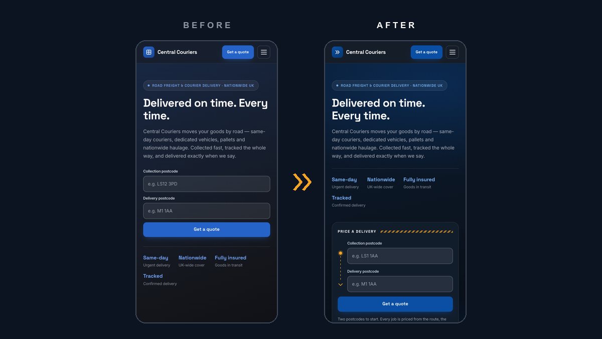
At phone width the old headline broke inside its second sentence and left “time.” on a line by itself. Each sentence is now held together as a unit, so the break falls between them, and either one still wraps inside itself if a screen is ever too narrow for it.
The same review found the brand mark in the header was a square quartered by a cross: a window pane, inherited from the template the site was forked from and sitting on every page of a road freight company. That is where the chevron came from.
Service pages that send you somewhere cheaper
The six service pages are the commercial pages the whole site points at. At the start they were around 570 words each and emitted no structured data of any kind. They are now between 1,084 and 1,262 words, and every section was written for that service rather than templated across all six: how the job runs from start to finish, what moves the price on that particular service, what to put in the brief so the first quote is the final one, the guides worth reading first, and the section that matters most.
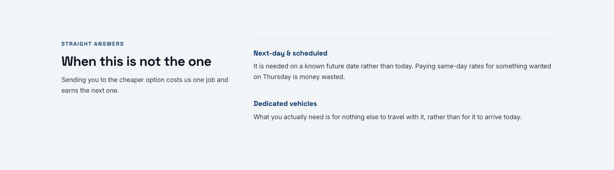
Every service page names the cases where a different service is the better buy, and links to it. The same-day page tells you to book next-day if the goods are wanted on Thursday. The dedicated-vehicle page tells you a shared pallet load is cheaper if the goods are robust. It costs the business the occasional job and earns the trust that brings back the next one, and it is the opposite of what most competitor pages do.
The pages now carry structured data as a single graph: a Service node with its service type and the areas it covers, a FAQPage built from the same questions the visitor reads, and a BreadcrumbList. The Service node deliberately carries no offer. An Offer without a price is noise, and every job here is quoted.
Cross-references between pages are the kind of link that rots without anyone noticing, so the test suite asserts that every guide a service page recommends is a real article, every alternative it names is a real service, and that no page names itself as its own alternative. The first run of those tests caught a page title Google would have truncated.
How freight is actually priced, said out loud
Freight pricing is opaque by habit, so the site explains it rather than hiding it. Distance is the distance the vehicle covers, including getting to you, not the gap between two postcodes. The vehicle class is a multiplier, and over-specifying it is the commonest and most expensive mistake. A deadline removes the option of sharing a vehicle. On a long run, whether there is a load for the return journey can matter more than anything else.
Each service page carries its own version of that list, and the quote page carries the general case under a heading that says what everyone is thinking: why this is quoted and not a price list. Alongside it, five guides were written for the questions a first-time freight customer actually searches: which van or lorry a load needs, UK and Euro pallet sizes and the height limits that catch people out, what sets the price of a courier job, how to build a pallet that survives handling, and why a Highlands delivery is a different kind of job from a Glasgow one. They are trade knowledge, not claims about the business, and each is linked from the service pages it serves.
One source, several outputs
Wherever the site states a fact in more than one place, it states it once and derives the rest.
Opening hours were three display strings, so they could be shown and nothing else could use them. The LocalBusiness data carried no opening hours at all, despite the hours appearing on every page. Each row now holds the machine facts, which weekdays, opens and closes, and the display text is generated from them. The same source produces the OpeningHoursSpecification in the structured data and a live line in the footer saying whether the business is open right now. That line converts the visitor’s clock to UK time first, because “are you open” is a question about Leeds, and a customer abroad must get the same answer as one in Leeds. It only appears with JavaScript, because a status baked in at build time would be wrong for most of the week. Sunday is “by arrangement”, which is neither open nor closed, and it is deliberately left out of the structured data: there is no honest way to say “ring us and we will see” in that vocabulary.
The same pattern runs through the rest. The service register generates the pages, the navigation, the footer links and the schema. The company’s identity was checked against the live Companies House register before anything was published, and from one confirmed record it now feeds the trading disclosure in the footer of every page, the same disclosure written into the confirmation emails, and a sameAs link from the structured data to the register entry, a verifiable link rather than a claim.
A footer that is the last place to start
The footer was four columns of links. On a site whose whole proposition is “tell us the route and we will price it”, the most-scrolled-to part of every page offered no way to begin.
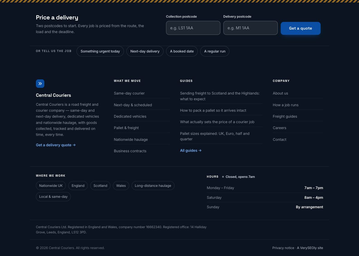
It now opens with two postcode fields. Below them, four job types are worded the way a customer would say them, and each lands on the quote form with that service already selected, because the form reads the choice from the link and checks it against its own options. The guides column reads the newest articles from the content collection, so a new guide is linked from every page the moment it is published. Every quote entry point on the site is attributed by source, and those source names are checked by the type checker, so an unregistered “Get a quote” button is a type error. An audit found five that were not registered, which would each have reported their quotes as coming from “other”. Type-checking was added to the project so that the next one cannot slip through unnoticed.
Written from the code, not from a template
The privacy notice describes what the software does, read off the source on the day it was written. There is no analytics, no tag manager, no advertising pixel and no cookie set by the site, which was verified by sweeping the code for each of them rather than assumed. There is no database: a submission becomes an email and nothing is stored on the website. Marketing consent is a separate, unticked box. The notice says all of that in plain words, and it lists the three things the business still has to confirm before relying on it, rather than papering over them.
The method: check what was built, not what was written
Most of what this project fixed was found by reading the built pages, not the source code, and several of the finds belong here precisely because they are embarrassing.
Three were live. The guides index carried the heading “Windows, doors and conservatory advice”, inherited verbatim from the template the site was forked from, because nobody had read their own blog index. The page meta promised a large share image on every page and there was no image at all, so every share went out without one. And the brand mark was the window pane described above.
Others were caught in the built pages before they shipped. A separator written as an HTML entity inside a code expression was escaped, so the page would have shown the literal text “·” between every area served. The article stylesheet put a tick on every list item, so numbered steps lost their numbers. Two quote forms on one page shared field identifiers, so clicking a label in the footer would have jumped the visitor to the form at the top.
After each fix, the whole built site was swept for the rest of that class of error: every trade in the estate’s other templates, every literal entity in the decoded text, every duplicated identifier. Each sweep came back clean before the work was called done.
Even this case study’s own screenshots went through it. The first cover capture showed the same four proof points twice in the first screen, once in the hero and again in a strip directly below it. Shortening the hero had pulled the duplicate into view. It was fixed on the live site before the image you see above was taken.
What this case study does not claim
No enquiries, because the forms are not switched on yet. No traffic figures and no ranking positions, because a site on its preview address with no domain has not had the chance to earn either, and the honest number for both today is effectively nothing. No client testimonial. No photographs of the fleet, because there are none yet, and the design is built to welcome them rather than fake them.
When the domain is chosen and the forms go live, this page will be updated with what actually happens, from analytics rather than memory.
What it does show is the standard: a site that only says what the business can stand behind, a design argued from the trade rather than from a template, and search work built into the structure rather than bolted on. If you want that standard applied to your business, get in touch.